
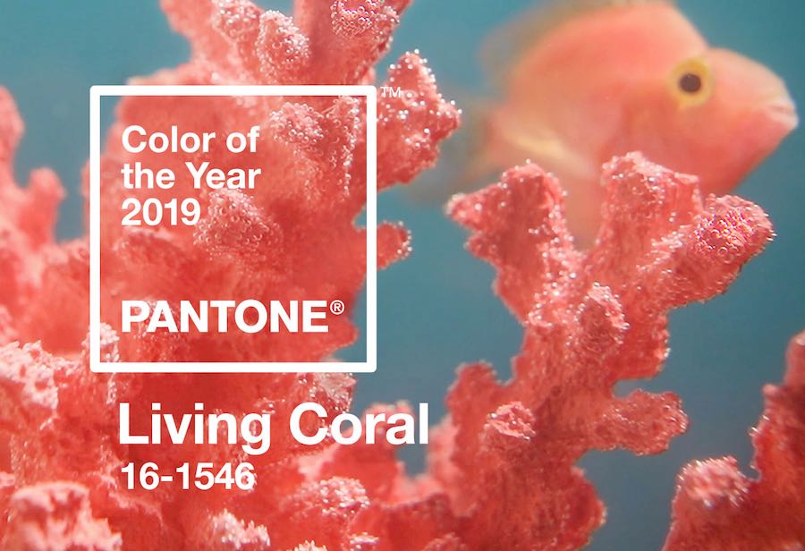
Living Coral: PANTONE Colour of the Year 2019. ©Pantone.
Every year, the team of experts at the Pantone Color Institute sifts through emerging trends and the global creative hypes to distill the spirit of the times into a single nuance. For 2019, they picked Living Coral – PANTONE 16-1546 – an “animating and life-affirming orange hue with a golden undertone that energizes and enlivens with a softer edge”.
RELATED STORY: Exposing the true colours of marketing… From Pantone Ultra Violet to chocolate purple battles
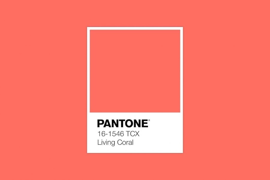
©Pantone.
Living Coral “symbolizes our innate need for optimism and joyful pursuits” reads the press release. We need to “get energy from nature. Just as coral reefs are a source of sustenance and shelter to sea life, vibrant yet mellow PANTONE 16-1546 Living Coral embraces us with warmth and nourishment to provide comfort and buoyancy in our continually shifting environment.”

Photo via IG, follow #LivingCoral.
It’s all so lighthearted and sweet. Unfortunately the real coral reefs across the seven seas are either dying or turning white. Indeed, due to global warming, water temperatures have become so high that the algae that give that unique and lively pigment are dying, causing the so-called coral bleaching phenomenon.
[su_slider source=”media: 21820,21821″ link=”image” target=”blank” width=”900″ height=”600″ title=”no” arrows=”no” pages=”no” mousewheel=”no” autoplay=”1600″ speed=”1″]
The question might be: where does the Living Coral ends and Dying coral begins? Ironically – but not so much -, Donald Trump’s ruddy face during his best Climate Change-denying rallies is closer to the Colour of the Year than the actual coral reef itself.
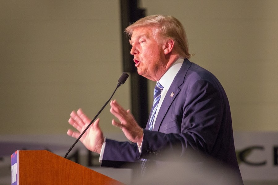
Donald Trump’s speach – Photo by Matt Johnson, CC.
“Pantone colour of the year harks naivety, not optimism.” Writes Michelle Ogundehin, former editor in chief of ELLE Decoration UK, in an editorial on Dezeen. “This seems an unfortunate symbolism, as headlines rage about climate change and the associated destruction of reefs worldwide”.
Photo via IG, follow @pantone.
“I’m always amused to read the inevitable crop of articles that immediately appear after such a pronouncement, championing its validity with an array of random products plucked from assorted image banks and quoting breathlessly from the press release. To say I’m dubious that this is little more than a marketing ploy by one of the world’s biggest colour companies would be something of an understatement.”
[su_youtube url=”https://www.youtube.com/watch?v=QXw4b1okgk0″ width=”900″ height=”600″]
“I might have predicted sewer-water grey or perhaps the livid yellow of the high-visibility vests worn by France’s gilets jaunes movement, a colour that screams distress like an Edvard Munch painting.” Writes fashion editor Jonathan Jones on The Guardian. “Only in times of panic do we crave the eternal splendour that living coral distils.” Just like Al Pacino gazing at a tacky tropical billboard as he dies in Carlito’s Way.

Frame from Carlitos Way’s final scene.
But hey! Someone has got to be feeling optimistic, right? Living Coral highlights our need for a positive attitude. Because in ‘darker times’ we’ve got the right to crave for bold lighthearted hues. Maybe we do wish a tonality that brings us back to Nature and the analogic world “in reaction to the onslaught of digital technology and social media increasingly embedding into daily life,” write at Pantone. Why then not posting it on Instagram? #LivingCoral has became so viral!

Photo via IG, follow @pantone.





Comments are closed.