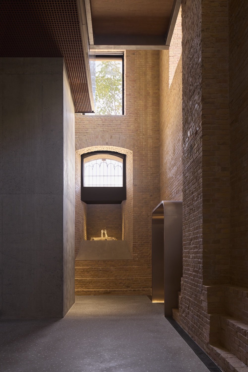
ABWAB 2026, In Other Words. Taleem by Varussi – Photo by TRIBEWNOS.
Design. Abwab, Arabic for “gate”, is the Dubai Design Week‘s platform that champions architects and designers from the Middle East, North Africa and South Asia. This year, it returned as In Other Words, a group exhibition that traced the ties between language, memory, and inherited knowledge through architecture, typography, textiles, and visual expression.
- RELATED STORIES: Read more about Dubai Design Week 2026 on Archipanic.

Cheent Devanagari by Kanaka Raghavan – Courtesy of the designer.
“Every act of communication involves design decisions,” said Caoimhe CJ Reynolds and Alexie Glass-Kantor, curators of this year’s group exhibition. What was made visible? What stayed unspoken? What got translated? The selected architects and designers explored “how meaning is communicated, translated and interpreted through material, form and space.”
Taleem by Varussi

Photo by TRIBEWNOS.
Taleem is a complex notation system used in Kashmiri carpet weaving and Kani shawl making, its symbols, numbers and colours guiding the maker from design to finished pattern. Dubai-based architecture and research practice Varussi recast that language as an architectural installation for In Other Words, offering visitors a new angle on an ancient weaving process.

Photo by TRIBEWNOS.
“Rather than reproducing the traditional patterns, the project examines the systems of knowledge that enable their production,” explain Varussi co-founders Owais Asif Khan and Samreen Junaid Wani. “The process also brings us into contact with the relationship between craft, material and architecture, reminding us that the act of making is often as important as the final form.”
Shhhhhhhh by Dalia Rafeh

Courtesy of Dubai Design Week.
Can silence be a language in its own right? Dalia Rafeh believes so: in a world of constant noise, repeated words and consumed messages, the absence of expression can mean a great deal. For Shhhhhhhh, the Lebanese multidisciplinary artist took the Arabic ش, with its familiar call for quiet, and turned it into a 7m-long commercial neon sign. Silence was made emphatically visible: a familiar gesture drifted between command, pause, reflection, and listening.
Cheent Devanagari by Kanaka Raghavan

Courtesy of the designer.
Dubai-based designer Kanaka Raghavan challenges Eurocentric ways of studying and experimenting with typography. She developed her typeface, Cheent Devanagari, through a decolonial lens, drawing on the art of block printing instead of Latin typographic rules.

Courtesy of the designer.
At In Other Words, the typeface took physical form as translucent textile layers hung in the space. Audiences who moved around them watched the letterform split apart and reassemble, a walk-through of how a typeface is made.
Non/Sense by UBIK

Courtesy of Dubai Design Week.
India-based conceptual artist UBIK took inspiration from science-fiction writer Philip K. Dick’s How to Build a Universe That Doesn’t Fall Apart Two Days Later for Non/Sense, a floor-based intervention. Fragments of text were run through translation, mistranslation, abbreviation and Lorem Ipsum, sliding from language into image, rhythm and spatial structure.

Courtesy of Dubai Design Week.
At In Other Words, visitors crossed a misleading pattern of distorted writings. UBIK said we are overwhelmed by too much communication. Since language is so easily misunderstood and misinterpreted, the artist poses a challenging question: “Do we really need to make sense of everything we encounter?”
A Library of Paper Memories by Grace Shieh

Courtesy of Dubai Design Week.
Grace Shieh’s A Library of Paper Memories treats handmade paper as a language of its own. “Paper is designed to be held,” said the writer and visual artist, who works between Taiwan, the US and the UAE. “The change is based on the people who touch it, the way you move with it.”

ABWAB 2026. A Library of Paper Memories by Grace Shieh – Courtesy of Dubai Design Week.
Drawing on papermaking, poetry and experimental writing, Shieh looked at how fibre, texture and form can hold memory, and how reading might stretch past the conventional page. The physical support of a message became its narrator. In Other Words, meaning does not travel on its own: it is carried, and the carrier always has something to say.

Courtesy of Dubai Design Week.